这篇笔记中二病犯了,希望大家不要嫌弃我!/(ㄒoㄒ)/~~
还有一件开心的事情,我明天可以开始学习JS了,有好的学习建议,学习资源不要忘了告诉一下我哦。蟹蟹。
————————————————————————分割线————————————————————————————
公共和个性化样式的合并
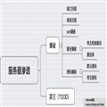
灵感:来自京东首页滚动广告右边的图标,如下图所示。
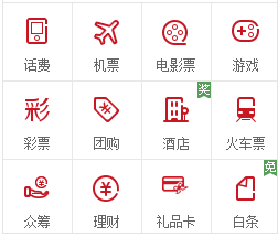
提取公共部分样式,个性化的再单独设置。
示例代码如下:
 1 <!DOCTYPE html>
 2 <html>
 3 <head>
 4 <meta http-equiv="Content-Type" content="text/html; charset=utf-8"/>
 5     <title>公共和个性化样式的合并</title>
 6     <meta charset="utf-8" />
 7     <style type="text/css">
 8         ul, li {
 9             margin:0px;
10             padding:0px;
11             list-style:none;
12             width:25px;
13             height:25px;
14             margin-bottom:10px;
15         }
16         .bg {
17             background:url(../img/jd.png) no-repeat;
18         }
19         .for2 {
20             background-position:0 -25px;
21             float:left;
22             margin-left:50px;
23         }
24         .for1 {
25             background-position:0 -100px;
26             float:left;
27             margin-left:50px;
28         }
29         .for3 {
30             background-position:0 -50px;
31         }
32         .for4 {
33             background-position:0 -75px;
34         }
35
36     </style>
37 </head>
38 <body>
39     <ul>
40         <li class="for1 bg">
41
42         </li>
43         <li class="for2 bg">
44
45         </li>
46         <li class="for3 bg">
47
48         </li>
49         <li class="for4 bg">
50
51         </li>
52     </ul>
53 </body>
54 </html>
运行结果:
分类菜单布局的实现
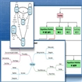
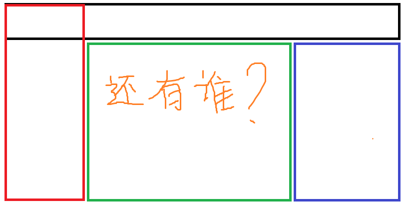
从整体上搭好框架,如下:(我一定是来搞笑的……我的字真的有那么丑啊……哈哈哈哈哈哈哈哈哈!!!!!!!!!)
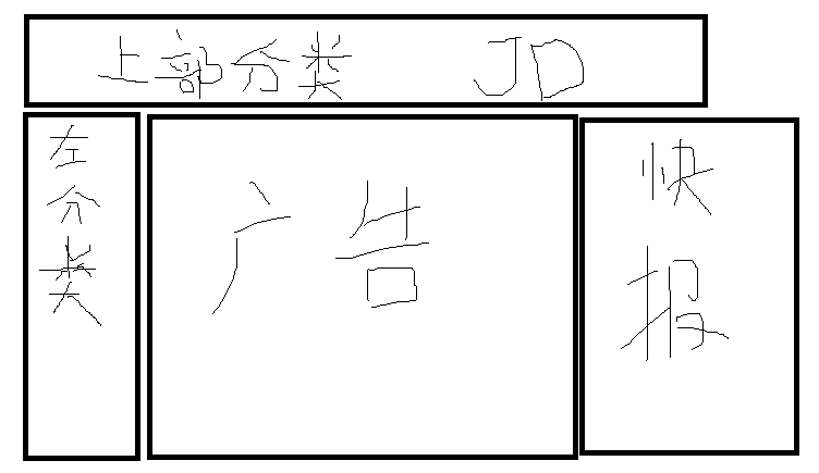
“上部分类”做父容器。“左分类”使用冲出层样式,设定它的高度比父容器的高度还要高。
“广告”使用margin-left,空出“做分类”的宽度,于是露出“广告”部分。
“快报”是另外的一个层,使用position定位到最右边。
哈哈哈哈哈这也行!!!!!!!!!我也是要疯了……………………
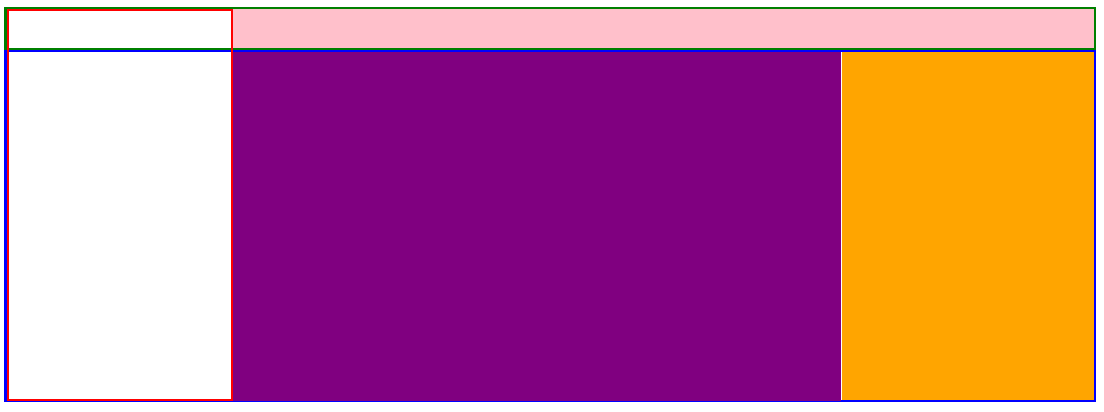
于是基本框架结构图应该如下:
我画起来图画我自己都害怕了……
写起来代码就更害怕了!
示例代码如下:
 1 <!DOCTYPE html>
 2 <html>
 3 <head>
 4     <meta http-equiv="Content-Type" content="text/html; charset=utf-8" />
 5     <title>京东分类菜单框架设计</title>
 6     <meta charset="utf-8" />
 7     <style type="text/css">
 8         .w {
 9             width:980px; /*一般不使用100%,通常用固定的像素值.设置为公共属性*/
10         }
11         #menu {
12             height: 35px;
13             line-height: 35px;
14             border: 2px solid green;
15             position:relative;/*因为子元素需要精确绝对定位*/
16         }
17
18             #menu #y-menu {
19                 height:350px;
20                 width:200px;
21                 border:2px solid red;
22                 position:absolute;
23                 left:0;
24                 top:0;
25             }
26             #menu #x-menu {
27                 height:35px;
28                 line-height:35px;
29                 background-color:pink;
30                 position:absolute;
31                 right:0;
32                 width:776px;
33             }
34         #ad {
35             height:314px;
36             border:2px solid blue;
37         }
38             #ad #ad-img {
39                 width:550px;
40                 height:315px;
41                 margin-left:202px;
42                 background-color:purple;
43             }
44             #report #report-content {
45                 width:227px;
46                 height:314px;
47                 background-color:orange;
48                 position:absolute;
49                 right:-2px;
50                 top:-316px;
51             }
52         #report {
53             background-color:gray;
54             position:relative;/*方便调整子元素的位置,用top值等于负数调整到上面去,此时此父容器高度为0*/
55         }
56     </style>
57 </head>
58 <body>
59     <!--横向和纵向分类菜单-大层固定-->
60     <div id="menu" class="w">
61         <!--纵向菜单-->
62         <div id="y-menu">
63
64         </div>
65         <!--横向菜单-->
66         <div id="x-menu">
67
68         </div>
69     </div>
70     <!--广告-->
71     <div id="ad" class="w">
72         <!--图片-->
73         <div id="ad-img">
74
75         </div>
76     </div>
77     <!--快报-->
78     <div id="report" class="w">
79         <div id="report-content">
80
81         </div>
82     </div>
83 </body>
84 </html>
运行结果如下:
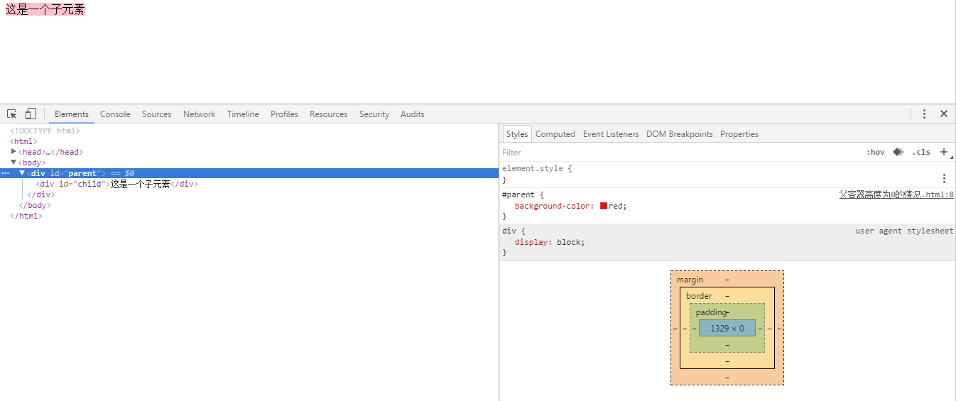
父容器高度为0
为什么有子元素,而父容器的高度依然是0?
情况一:子元素为绝对定位,也就是说position:absolute
示例代码如下:
 1 <!DOCTYPE html>
 2 <html>
 3 <head>
 4 <meta http-equiv="Content-Type" content="text/html; charset=utf-8"/>
 5     <title>父容器高度为0的两种情况</title>
 6     <meta charset="utf-8" />
 7     <style type="text/css">
 8         #parent {
 9             background-color:red;
10         }
11         #child {
12             position:absolute;
13             background-color:pink;
14         }
15     </style>
16 </head>
17 <body>
18     <div id="parent">
19         <div id="child">这是一个子元素</div>
20     </div>
21 </body>
22 </html>
运行结果:
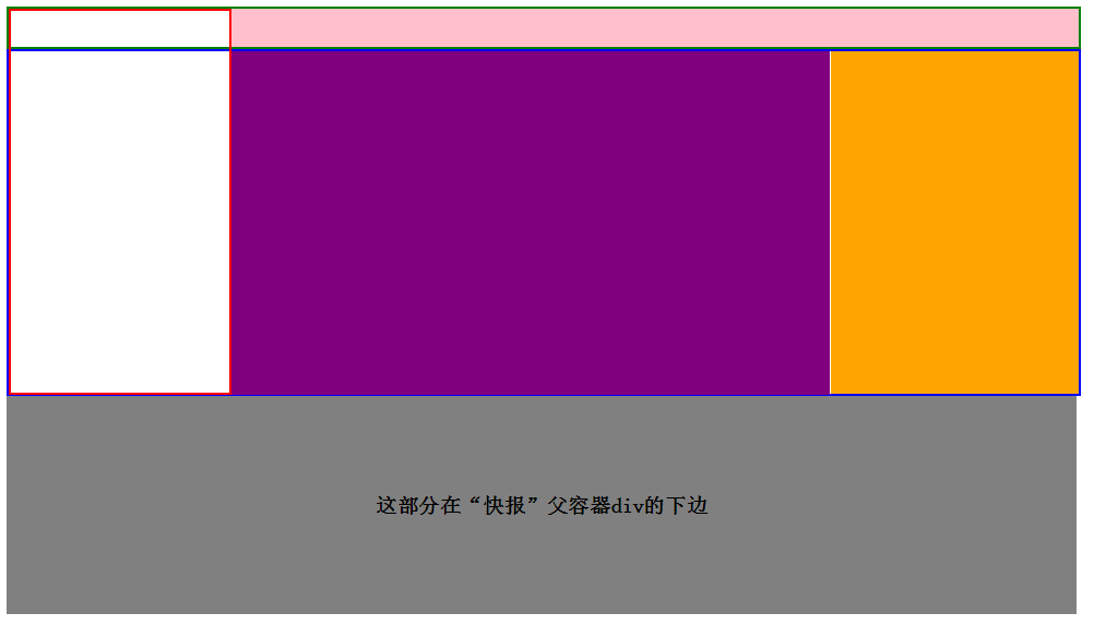
在京东分类菜单布局的实现的案例中,“快报”部分就是使用了这种思想:它把“快报”部分设置为position:absolute后,“快报”部分的父容器高度变成了0。此时才能在整个分类菜单的下面显示新的div框架,用来显示物品的列表,中间并没有“快报”父元素所占用的空隙。示例代码如下:
 1 <!DOCTYPE html>
 2 <html>
 3 <head>
 4     <meta http-equiv="Content-Type" content="text/html; charset=utf-8" />
 5     <title>京东分类菜单框架设计</title>
 6     <meta charset="utf-8" />
 7     <style type="text/css">
 8         .w {
 9             width:980px; /*一般不使用100%,通常用固定的像素值.设置为公共属性*/
10         }
11         #menu {
12             height: 35px;
13             line-height: 35px;
14             border: 2px solid green;
15             position:relative;/*因为子元素需要精确绝对定位*/
16         }
17
18             #menu #y-menu {
19                 height:350px;
20                 width:200px;
21                 border:2px solid red;
22                 position:absolute;
23                 left:0;
24                 top:0;
25             }
26             #menu #x-menu {
27                 height:35px;
28                 line-height:35px;
29                 background-color:pink;
30                 position:absolute;
31                 right:0;
32                 width:776px;
33             }
34         #ad {
35             height:314px;
36             border:2px solid blue;
37         }
38             #ad #ad-img {
39                 width:550px;
40                 height:315px;
41                 margin-left:202px;
42                 background-color:purple;
43             }
44             #report #report-content {
45                 width:227px;
46                 height:314px;
47                 background-color:orange;
48                 position:absolute;
49                 right:-2px;
50                 top:-316px;
51             }
52         #report {
53             background-color:gray;
54             position:relative;/*方便调整子元素的位置,用top值等于负数调整到上面去,此时此父容器高度为0*/
55         }
56     </style>
57 </head>
58 <body>
59     <!--横向和纵向分类菜单-大层固定-->
60     <div id="menu" class="w">
61         <!--纵向菜单-->
62         <div id="y-menu">
63
64         </div>
65         <!--横向菜单-->
66         <div id="x-menu">
67
68         </div>
69     </div>
70     <!--广告-->
71     <div id="ad" class="w">
72         <!--图片-->
73         <div id="ad-img">
74
75         </div>
76     </div>
77     <!--快报-->
78     <div id="report" class="w">
79         <div id="report-content">
80
81         </div>
82     </div>
83     <div class="w" style="height:200px;line-height:200px; background-color:gray;text-align:center;">
84         <b style="font-size:larger;">这部分在“快报”父容器div的下边</b>
85     </div>
86 </body>
87 </html>
运行结果:

 相关文章
相关文章