一、功能描述
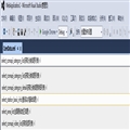
该插件的功能跟代码文件的导航功能类似,只是下拉框里的内容是元素的某一属性值,如图-1所示

图-1
当点击下拉框的选项后,会自动定位到该内容在xml文件的位置。此功能适用于xml文件内容较多的情况。
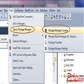
二、选择Editor Margin插件模板
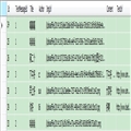
因为该插件模板会在编辑区的底部创建一个WPF控件,如图-2所示。

图-2
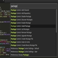
而你可以创建一个WPF用户控件,并将用户控件添加到该控件里,还可以改变该控件在编辑区的位置。按照Editor Margin模板的向导建立插件项目,在项目里有三个文件:source.extension.vsixmanifest、EditorMargin1、EditorMargin1Factory,改变位置是通过EditorMargin1Factory类的MarginContainerAttribute特性实现的,该特性接收PredefinedMarginNames静态类的常量字段,这些常量字段定义了控件可以停靠的位置,如图-3所示。具体的功能主要是在EditorMargin1文件里实现。

图-3
当文档打开的时候VS会加载MarginFactory类的CreateMargin方法执行。
三、创建WPF用户控件
在项目里添加一个WPF用户控件,在用户控件里添加一个ComboBox下拉控件,当下拉框的选项改变的时候触发定位操作。由于我们是在用户控件里添加下拉控件,在用户控件外部无法监控到下拉框的改变事件,所以我们需要在用户控件里添加一个事件,在下拉框改变事件里触发该事件,这样就可以间接订阅下拉框的选项改变事件。此外,还需要对外开放一个改变下拉框宽度的函数,用于编辑区大小改变的时候可以修改下拉框的宽度。具体的代码如下所示:
/// <summary>
/// MappingInfo.xaml 的交互逻辑
/// </summary>
public partial class MappingInfo : UserControl
{
  public delegate void DelegateSelectionChanged(object sender, SelectionChangedEventArgs e);
  public event DelegateSelectionChanged SelectionChanged;

  public MappingInfo()
  {
    InitializeComponent();
  }

  public MappingInfo(IEnumerable<XElement> elements)
  {
    InitializeComponent();
    List<Elements> list = new List<Elements>();
    foreach (var item in elements)
    {
      if (item.Attribute("name") == null)
        continue;
      Elements model = new Elements();
      model.Value = item.Attribute("name").Value;
      string desc = item.Attribute("title") != null ? item.Attribute("title").Value : item.Attribute("remark") == null ? "" : item.Attribute("remark").Value;
      string cache = item.Attribute("cache") != null ? item.Attribute("cache").Value : "";
      model.Text = desc != "" ? string.Format("{0}({1})", model.Value, desc) : model.Value;
      if (cache != "" && cache.Equals("true", StringComparison.OrdinalIgnoreCase))
      {
        model.Text += " √";
      }
      list.Add(model);
    }
    cbElement.DisplayMemberPath = "Text";
    cbElement.SelectedValuePath = "Value";
    cbElement.ItemsSource = list;
    cbElement.SelectedIndex = 0;
    //订阅选项改变时的事件
    cbElement.SelectionChanged += cbElement_SelectionChanged;
  }

  void cbElement_SelectionChanged(object sender, SelectionChangedEventArgs e)
  {
    SelectionChanged(sender, e);
  }

  public void SetComboBoxWidth(double width)
  {
    this.cbElement.Width = width;
  }
}

class Elements
{
  public string Text { get; set; }
  public string Value { get; set; }
}
在EditorMargin1类的构造函数里将自定义的wpf用户控件添加到插件创建的控件里
//设置导航栏的相关信息
this.Height = 25;
this.ClipToBounds = false;
this.Background = new SolidColorBrush(Colors.WhiteSmoke);
this.Children.Add(mapInfo);
//导航栏大小改变时改变下拉框的宽度
this.SizeChanged += Navigate_SizeChanged;
四、使用户控件自适应编辑区宽度
要实现自适应的功能只需要在XmlFileNavigation类的构造函数里订阅SizeChanged事件,由于EditorMargin1类继承了Canvas类,而Canvas类又从其他类继承了SizeChanged事件,所以只要通过this.SizeChanged就可以订阅该事件,在事件里调用创建的用户控件对外开发的修改宽度函数即可。代码如下所示:
/// <summary>
/// 大小改变时下拉框也一起调整
/// </summary>
/// <param name="sender"></param>
/// <param name="e"></param>
void Navigate_SizeChanged(object sender, SizeChangedEventArgs e)
{
  //调整下拉框大小
  //mapinfo为添加的wpf用户控件
  mapInfo.SetComboBoxWidth(((EditorMargin1)sender).ActualWidth); }
为什么要在SizeChanged事件里设置下拉框的宽度,在EditorMargin1类的构造函数里设置就不行吗?因为在构造函数里获取编辑区宽度的话,第一个页面获取的宽度是不准确的,获取的宽度都是800,之后打开的页面的宽度才是正常的。有兴趣的同学可以在EditorMargin1类的构造函数里添加如下的代码,获取文档的宽度验证一下
EnvDTE.DTE dte=ServiceProvider.GlobalProvider.GetService(typeof(DTE)) as DTE;
double width = dte.ActiveDocument.ActiveWindow.Width;
五、根据选中的内容进行定位
由于该插件是针对xml文件的,而VS没有提供对xml文件内容的定位方法(可能是我还不知道),所以只能通过遍历整个文件来确定选中的内容是在文件中的行数。以下是在用户控件的响应事件里对选中的内容进行定位的代码:
/// <summary>
/// 下拉框改变事件
/// </summary>
/// <param name="sender"></param>
/// <param name="e"></param>
void cb_SelectionChanged(object sender, SelectionChangedEventArgs e)
{
  try
  {
    //获取下拉框选中项
    Elements model = (Elements)((ComboBox)sender).SelectedItem;
    //获取DTE实例
    DTE dte = ServiceProvider.GlobalProvider.GetService(typeof(DTE)) as DTE;
    //找出选中项在xml文件里的行数
    string[] lines = File.ReadAllLines(dte.ActiveDocument.FullName);
    int line = 0;
    foreach (var item in lines)
    {
      line++;
      if (item != "" && item.Contains(model.Value))
      {
        break;
      }
    }
    //滚动条滚动到指定行数并显示光标
    TextSelection selection = dte.ActiveDocument.Selection as TextSelection;
    if (selection != null)
    {
      selection.MoveToLineAndOffset(line, 3);
      selection.ActivePoint.TryToShow();
    }
  }
  catch (Exception ex)
  {
    MessageBox.Show(ex.Message, "提示", MessageBoxButton.OK, MessageBoxImage.Error);
  }
}
如果要开发的导航插件式针对cs文件的话可以通过下面的代码获取cs文件里的字段、函数、事件、属性等的相关信息:
dte.ActiveDocument.ProjectItem.FileCodeModel
以下的代码是针对ComboBox的美化样式
 logs_code_hide('d519b9c0-2d74-4ee8-a748-2e0bba465444',event)" src="/Upload/Images/2014111815/2B1B950FA3DF188F.gif" alt="" />
  1 <UserControl.Resources>
  2         <ControlTemplate x:Key="ComboBoxToggleButton" TargetType="{x:Type ToggleButton}">
  3             <Grid>
  4                 <Grid.ColumnDefinitions>
  5                     <ColumnDefinition />
  6                     <ColumnDefinition Width="15" />
  7                 </Grid.ColumnDefinitions>
  8                 <Border
  9   x:Name="Border"
 10   Grid.ColumnSpan="2"
 11   CornerRadius="0"
 12   Background="#FCFCFC"
 13   BorderBrush="#9BA7B7"
 14   BorderThickness="1 1 1 1" />
 15                 <Border
 16   Grid.Column="0"
 17   CornerRadius="0"
 18   Margin="1"
 19   Background="#FCFCFC"
 20   BorderBrush="#9BA7B7"
 21   BorderThickness="0" />
 22                 <Path
 23   x:Name="Arrow"
 24   Grid.Column="1"
 25   Fill="Black"
 26   HorizontalAlignment="Center"
 27   VerticalAlignment="Center"
 28   Data="M 0 0 L 4 4 L 8 0 Z"/>
 29             </Grid>
 30             <ControlTemplate.Triggers>
 31                 <Trigger Property="ToggleButton.IsMouseOver" Value="true">
 32                     <Setter TargetName="Border" Property="Background" Value="#FDF4BF" />
 33                     <Setter TargetName="Border" Property="BorderBrush" Value="#FFEC8B" />
 34                 </Trigger>
 35                 <Trigger Property="ToggleButton.IsChecked" Value="true">
 36                     <Setter TargetName="Border" Property="Background" Value="#FFEC8B" />
 37                 </Trigger>
 38                 <Trigger Property="IsEnabled" Value="False">
 39                     <Setter TargetName="Border" Property="Background" Value="#EEEEEE" />
 40                     <Setter TargetName="Border" Property="BorderBrush" Value="#AAAAAA" />
 41                     <Setter Property="Foreground" Value="#888888"/>
 42                     <Setter TargetName="Arrow" Property="Fill" Value="#888888" />
 43                 </Trigger>
 44             </ControlTemplate.Triggers>
 45         </ControlTemplate>
 46
 47         <ControlTemplate x:Key="ComboBoxTextBox" TargetType="{x:Type TextBox}">
 48             <Border x:Name="PART_ContentHost" Focusable="False" Background="{TemplateBinding Background}" />
 49         </ControlTemplate>
 50
 51         <Style x:Key="{x:Type ComboBox}" TargetType="{x:Type ComboBox}">
 52             <Setter Property="SnapsToDevicePixels" Value="true"/>
 53             <Setter Property="OverridesDefaultStyle" Value="true"/>
 54             <Setter Property="ScrollViewer.HorizontalScrollBarVisibility" Value="Auto"/>
 55             <Setter Property="ScrollViewer.VerticalScrollBarVisibility" Value="Auto"/>
 56             <Setter Property="ScrollViewer.CanContentScroll" Value="true"/>
 57             <Setter Property="Template">
 58                 <Setter.Value>
 59                     <ControlTemplate TargetType="{x:Type ComboBox}">
 60                         <Grid>
 61                             <ToggleButton
 62         Name="ToggleButton"
 63         Template="{StaticResource ComboBoxToggleButton}"
 64         Grid.Column="2"
 65         Focusable="false"
 66         IsChecked="{Binding Path=IsDropDownOpen,Mode=TwoWay,RelativeSource={RelativeSource TemplatedParent}}"
 67         ClickMode="Press">
 68                             </ToggleButton>
 69                             <ContentPresenter
 70         Name="ContentSite"
 71         IsHitTestVisible="False"
 72         Content="{TemplateBinding SelectionBoxItem}"
 73         ContentTemplate="{TemplateBinding SelectionBoxItemTemplate}"
 74         ContentTemplateSelector="{TemplateBinding ItemTemplateSelector}"
 75         Margin="5,3,23,3"
 76         VerticalAlignment="Center"
 77         HorizontalAlignment="Left" />
 78                             <TextBox x:Name="PART_EditableTextBox"
 79         Style="{x:Null}"
 80         Template="{StaticResource ComboBoxTextBox}"
 81         HorizontalAlignment="Left"
 82         VerticalAlignment="Center"
 83         Margin="5,3,23,3"
 84         Focusable="True"
 85         Background="Transparent"
 86         Visibility="Hidden"
 87         IsReadOnly="{TemplateBinding IsReadOnly}"/>
 88                             <Popup
 89         Name="Popup"
 90         Placement="Bottom"
 91         IsOpen="{TemplateBinding IsDropDownOpen}"
 92         AllowsTransparency="True"
 93         Focusable="False"
 94         PopupAnimation="Slide">
 95                                 <Grid
 96           Name="DropDown"
 97           SnapsToDevicePixels="True"
 98           MinWidth="{TemplateBinding ActualWidth}"
 99           MaxHeight="{TemplateBinding MaxDropDownHeight}" >
100                                     <Border
101             x:Name="DropDownBorder"
102             Background="#EFEFEF"
103             BorderThickness="1 1 1 1"
104             CornerRadius="0"
105             BorderBrush="Gray"/>
106                                     <ScrollViewer Margin="5,6,4,6" SnapsToDevicePixels="True">
107                                         <StackPanel IsItemsHost="True" KeyboardNavigation.DirectionalNavigation="Contained" />
108                                     </ScrollViewer>
109                                 </Grid>
110                             </Popup>
111                         </Grid>
112                         <ControlTemplate.Triggers>
113                             <Trigger Property="HasItems" Value="false">
114                                 <Setter TargetName="DropDownBorder" Property="MinHeight" Value="95"/>
115                             </Trigger>
116                             <Trigger Property="IsEnabled" Value="false">
117                                 <Setter Property="Foreground" Value="#888888"/>
118                             </Trigger>
119                             <Trigger Property="IsGrouping" Value="true">
120                                 <Setter Property="ScrollViewer.CanContentScroll" Value="false"/>
121                             </Trigger>
122                             <Trigger Property="IsEditable"
123            Value="true">
124                                 <Setter Property="IsTabStop" Value="false"/>
125                                 <Setter TargetName="PART_EditableTextBox" Property="Visibility" Value="Visible"/>
126                                 <Setter TargetName="ContentSite" Property="Visibility" Value="Hidden"/>
127                             </Trigger>
128                         </ControlTemplate.Triggers>
129                     </ControlTemplate>
130                 </Setter.Value>
131             </Setter>
132             <Style.Triggers>
133             </Style.Triggers>
134         </Style>
135
136         <Style x:Key="{x:Type ComboBoxItem}" TargetType="{x:Type ComboBoxItem}">
137             <Setter Property="SnapsToDevicePixels" Value="true"/>
138             <Setter Property="OverridesDefaultStyle" Value="true"/>
139             <Setter Property="Template">
140                 <Setter.Value>
141                     <ControlTemplate TargetType="{x:Type ComboBoxItem}">
142                         <Border
143       Name="Border"
144       Padding="2"
145                             BorderThickness="1"
146       SnapsToDevicePixels="true">
147                             <ContentPresenter />
148                         </Border>
149                         <ControlTemplate.Triggers>
150                             <!--<Trigger Property="IsHighlighted" Value="true">
151                                 <Setter TargetName="Border" Property="Background" Value="Gray"/>
152                             </Trigger>-->
153                             <Trigger Property="IsMouseOver" Value="true">
154                                 <Setter TargetName="Border" Property="Background" Value="#FCFCFC" />
155                                 <Setter TargetName="Border" Property="BorderBrush" Value="#E5C365" />
156                             </Trigger>
157                             <Trigger Property="IsEnabled" Value="false">
158                                 <Setter Property="Foreground" Value="#888888"/>
159                             </Trigger>
160                         </ControlTemplate.Triggers>
161                     </ControlTemplate>
162                 </Setter.Value>
163             </Setter>
164         </Style>
165     </UserControl.Resources>
View Code

 相关文章
相关文章