编码前
无外观自定义控件的定义在上一篇中已经有了,至于这一篇的自定义控件,比之前多加入了状态的变化,就像默认的Button具有Pressed、Normal等状态。在状态转变的同时可以加上一些动画,可以让控件看起来更自然。
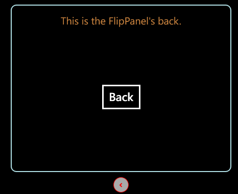
FlipPanel控件的功能介绍:它具有两个状态,Normal和Flipped。当Normal状态时,控件显示正面的内容;当为Flipped状态时,控件显示反面的内容。除此之外,控件还有一个按钮,用来两个状态的跳转,并且也会随着状态的变化而有显示上的不同。
编码:
public class FlipPanel :Control
    {
        public FlipPanel()
        {
            DefaultStyleKey = typeof (FlipPanel);
        }
        。。。。。。
    }
public static readonly DependencyProperty IsFlipedProperty = DependencyProperty.Register(
            "IsFliped", typeof (bool), typeof (FlipPanel), new PropertyMetadata(default(bool)));

        public bool IsFliped
        {
            get { return (bool) GetValue(IsFlipedProperty); }
            set { SetValue(IsFlipedProperty, value); }
        }

        public static readonly DependencyProperty FrontContentProperty = DependencyProperty.Register(
            "FrontContent", typeof (object), typeof (FlipPanel), new PropertyMetadata(default(object)));

        public object FrontContent
        {
            get { return (object) GetValue(FrontContentProperty); }
            set { SetValue(FrontContentProperty, value); }
        }

        public static readonly DependencyProperty BackContentProperty = DependencyProperty.Register(
            "BackContent", typeof (object), typeof (FlipPanel), new PropertyMetadata(default(object)));

        public object BackContent
        {
            get { return (object) GetValue(BackContentProperty); }
            set { SetValue(BackContentProperty, value); }
        }

        public static readonly DependencyProperty CornerRadiusProperty = DependencyProperty.Register(
            "CornerRadius", typeof (CornerRadius), typeof (FlipPanel), new PropertyMetadata(default(CornerRadius)));

        public CornerRadius CornerRadius
        {
            get { return (CornerRadius) GetValue(CornerRadiusProperty); }
            set { SetValue(CornerRadiusProperty, value); }
        }
<Style TargetType="local:FlipPanel">
        <Setter Property="Template">
            <Setter.Value>
                <ControlTemplate TargetType="local:FlipPanel">
                    <Grid>
                        <Grid.RowDefinitions>
                            <RowDefinition Height="Auto"/>
                            <RowDefinition Height="Auto"/>
                        </Grid.RowDefinitions>
                        <!--This is the front content.-->
                        <Border x:Name="FrontContent" BorderBrush="{TemplateBinding BorderBrush}" BorderThickness="{TemplateBinding BorderThickness}" CornerRadius="{TemplateBinding CornerRadius}"
                                Background="{TemplateBinding Background}">
                            <ContentPresenter Content="{TemplateBinding FrontContent}"/>
                        </Border>
                        <!--This is the back content.-->
                        <Border x:Name="BackContent" Opacity="0" BorderBrush="{TemplateBinding BorderBrush}" BorderThickness="{TemplateBinding BorderThickness}" Background="{TemplateBinding Background}"
                                CornerRadius="{TemplateBinding CornerRadius}">
                            <ContentPresenter Content="{TemplateBinding BackContent}"/>
                        </Border>
                        <!--This is the flip button.-->
                        <ToggleButton Grid.Row="1" x:Name="FlipButton" RenderTransformOrigin="0.5,0.5" Margin="0,10,0,0" Height="30" Width="30">
                            <ToggleButton.Template>
                                <ControlTemplate>
                                    <Grid>
                                        <Ellipse Stroke="Red" Fill="DarkGray"/>
                                        <Path Data="M1,1.5 L4.5,5 8,1.5" Stroke="Red" HorizontalAlignment="Center" VerticalAlignment="Center" StrokeThickness="2"/>
                                    </Grid>
                                </ControlTemplate>
                            </ToggleButton.Template>
                            <ToggleButton.RenderTransform>
                                <RotateTransform x:Name="FlipButtonTransform" Angle="-90" />
                            </ToggleButton.RenderTransform>
                        </ToggleButton>

                        <VisualStateManager.VisualStateGroups>
                            <VisualStateGroup x:Name="ViewStates">
                                <VisualState x:Name="Normal">
                                    <Storyboard>
                                        <DoubleAnimation Storyboard.TargetName="BackContent" Storyboard.TargetProperty="Opacity" To="0" Duration="0:0:1"/>
                                        <DoubleAnimation Storyboard.TargetName="FrontContent" Storyboard.TargetProperty="Opacity" To="1" Duration="0:0:1"/>
                                        <DoubleAnimation Storyboard.TargetName="FlipButtonTransform" Storyboard.TargetProperty="Angle" To="-90" Duration="0:0:1"/>
                                    </Storyboard>
                                </VisualState>
                                <VisualState x:Name="Flipped">
                                    <Storyboard>
                                        <DoubleAnimation Storyboard.TargetName="BackContent" Storyboard.TargetProperty="Opacity" To="1" Duration="0:0:1"/>
                                        <DoubleAnimation Storyboard.TargetName="FlipButtonTransform" Storyboard.TargetProperty="Angle" To="90" Duration="0:0:1"/>
                                        <DoubleAnimation Storyboard.TargetName="FrontContent" Storyboard.TargetProperty="Opacity" To="0" Duration="0:0:1"/>
                                    </Storyboard>
                                </VisualState>
                            </VisualStateGroup>
                        </VisualStateManager.VisualStateGroups>
                    </Grid>
                </ControlTemplate>
            </Setter.Value>
        </Setter>
    </Style>
1.上面的XAML与之前的定义控件外观差不多,有两个Border,一个ToggleButton组成。其中Border中显示的ContentPresenter中的内容绑定到了控件中内容的属性上,及FrontContent和BackContent。并且多了一个关于状态的设置。
2.这里如同上面介绍的,控件具有两个状态,这两个状态属于对立的状态(及同时只能处在其中一个状态中),他们是在一个名为ViewStates的状态分组中。
3.在转化到不同状态时,使用了动画,用来让转化过程平滑一点。
4.建议为FlipPanel控件类应用TemplatePart特性,包括可视化状态TemplateVisualState:
 [TemplatePart(Name = "FlipButton",Type = typeof(ToggleButton)),
  TemplateVisualState(Name = "Normal",GroupName = "ViewStates"),
  TemplateVisualState(Name = "Flipped",GroupName = "VisualStates")]
 1         public override void OnApplyTemplate()
 2         {
 3             base.OnApplyTemplate();
 4             ToggleButton flipButton = GetTemplateChild("FlipButton") as ToggleButton;
 5             if(flipButton!=null)
 6                 flipButton.Click += flipButton_Click;
 7         }
 8
 9        void flipButton_Click(object sender, RoutedEventArgs e)
10         {
11             this.IsFliped = !this.IsFliped;
12         }
此刻点击FlipButton按钮就可以改变控件的状态了,也就是IsFlipped的值。
1         private void OnChangedState(bool useTransitions)
2         {
3             if (IsFliped)
4                 VisualStateManager.GoToState(this, "Flipped", useTransitions);
5             else
6                 VisualStateManager.GoToState(this, "Normal", useTransitions);
7         }
GoToState中第一个参数为发生状态变化的控件,第二个参数就是控件所要到达的状态,第三个参数是否使用状态过渡
并且在OnApplyTemplate函数和flipButton_Click函数中进行调用
 1         public override void OnApplyTemplate()
 2         {
 3             base.OnApplyTemplate();
 4             ToggleButton flipButton = GetTemplateChild("FlipButton") as ToggleButton;
 5             if(flipButton!=null)
 6                 flipButton.Click += flipButton_Click;
 7             OnChangedState(false);
 8         }
 9
10         void flipButton_Click(object sender, RoutedEventArgs e)
11         {
12             this.IsFliped = !this.IsFliped;
13             OnChangedState(true);
14         }
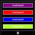
<control:FlipPanel  BorderBrush="PowderBlue" BorderThickness="2" CornerRadius="10" Margin="12">
                    <control:FlipPanel.FrontContent>
                        <StackPanel Margin="6">
                            <Button Background="Purple" Margin="3" Content="FrontContent1"/>
                            <Button Background="Red" Margin="3" Content="FrontContent2"/>
                            <Button Background="Blue" Margin="3" Content="FrontContent3"/>
                            <Button Background="GreenYellow" Margin="3" Content="FrontContent4"/>
                        </StackPanel>
                    </control:FlipPanel.FrontContent>
                    <control:FlipPanel.BackContent>
                        <Grid Margin="12">
                            <Grid.RowDefinitions>
                                <RowDefinition Height="Auto"/>
                                <RowDefinition/>
                            </Grid.RowDefinitions>
                            <TextBlock  FontSize="20" Margin="3" HorizontalAlignment="Center" Foreground="Peru">This is the FlipPanel's back.</TextBlock>
                            <Button Grid.Row="2" Margin="3" Content="Back" HorizontalAlignment="Center" VerticalAlignment="Center"/>
                        </Grid>
                    </control:FlipPanel.BackContent>
                </control:FlipPanel>
Normal状态下截图为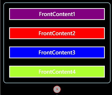
编码后


 相关文章
相关文章