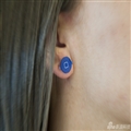
先上效果图

样式很简单,供新手学习
以下是样式代码:
 1 <Style x:Key="CheckRadioFocusVisual">
 2         <Setter Property="Control.Template">
 3             <Setter.Value>
 4                 <ControlTemplate>
 5                     <Rectangle Margin="14,0,0,0" SnapsToDevicePixels="true" Stroke="{DynamicResource {x:Static SystemColors.ControlTextBrushKey}}" StrokeThickness="1" StrokeDashArray="1 2"/>
 6                 </ControlTemplate>
 7             </Setter.Value>
 8         </Setter>
 9     </Style>
10     <Style x:Key="SliderCheckBox" TargetType="{x:Type CheckBox}">
11         <Setter Property="Foreground" Value="{DynamicResource {x:Static SystemColors.ControlTextBrushKey}}"/>
12         <Setter Property="BorderThickness" Value="1"/>
13         <Setter Property="Cursor" Value="Hand" />
14         <Setter Property="Template">
15             <Setter.Value>
16                 <ControlTemplate TargetType="{x:Type CheckBox}">
17                     <ControlTemplate.Resources>
18                         <Storyboard x:Key="StoryboardIsChecked">
19                             <DoubleAnimationUsingKeyFrames Storyboard.TargetProperty="(UIElement.RenderTransform).(TransformGroup.Children)[3].(TranslateTransform.X)" Storyboard.TargetName="CheckFlag">
20                                 <EasingDoubleKeyFrame KeyTime="0" Value="0"/>
21                                 <EasingDoubleKeyFrame KeyTime="0:0:0.2" Value="14"/>
22                             </DoubleAnimationUsingKeyFrames>
23                         </Storyboard>
24                         <Storyboard x:Key="StoryboardIsCheckedOff">
25                             <DoubleAnimationUsingKeyFrames Storyboard.TargetProperty="(UIElement.RenderTransform).(TransformGroup.Children)[3].(TranslateTransform.X)" Storyboard.TargetName="CheckFlag">
26                                 <EasingDoubleKeyFrame KeyTime="0" Value="14"/>
27                                 <EasingDoubleKeyFrame KeyTime="0:0:0.2" Value="0"/>
28                             </DoubleAnimationUsingKeyFrames>
29                         </Storyboard>
30                     </ControlTemplate.Resources>
31                     <BulletDecorator Background="Transparent" SnapsToDevicePixels="true">
32                         <BulletDecorator.Bullet>
33                             <Border x:Name="ForegroundPanel" BorderThickness="1" Width="35" Height="20" CornerRadius="10">
34                                 <Canvas>
35                                     <Border Background="White" x:Name="CheckFlag" CornerRadius="10" VerticalAlignment="Center" BorderThickness="1" Width="19" Height="18" RenderTransformOrigin="0.5,0.5">
36                                         <Border.RenderTransform>
37                                             <TransformGroup>
38                                                 <ScaleTransform/>
39                                                 <SkewTransform/>
40                                                 <RotateTransform/>
41                                                 <TranslateTransform/>
42                                             </TransformGroup>
43                                         </Border.RenderTransform>
44                                         <Border.Effect>
45                                             <DropShadowEffect ShadowDepth="1" Direction="180" />
46                                         </Border.Effect>
47                                     </Border>
48                                 </Canvas>
49                             </Border>
50                         </BulletDecorator.Bullet>
51                         <ContentPresenter HorizontalAlignment="{TemplateBinding HorizontalContentAlignment}" Margin="{TemplateBinding Padding}" RecognizesAccessKey="True" SnapsToDevicePixels="{TemplateBinding SnapsToDevicePixels}" VerticalAlignment="Center"/>
52                     </BulletDecorator>
53                     <ControlTemplate.Triggers>
54                         <Trigger Property="HasContent" Value="true">
55                             <Setter Property="FocusVisualStyle" Value="{StaticResource CheckRadioFocusVisual}"/>
56                             <Setter Property="Padding" Value="4,0,0,0"/>
57                         </Trigger>
58                         <Trigger Property="IsEnabled" Value="false">
59                             <Setter Property="Foreground" Value="{DynamicResource {x:Static SystemColors.GrayTextBrushKey}}"/>
60                         </Trigger>
61                         <Trigger Property="IsChecked" Value="True">
62                             <Setter TargetName="ForegroundPanel" Property="Background" Value="{DynamicResource Accent}" />
63                             <Trigger.EnterActions>
64                                 <BeginStoryboard x:Name="BeginStoryboardCheckedTrue" Storyboard="{StaticResource StoryboardIsChecked}" />
65                                 <RemoveStoryboard BeginStoryboardName="BeginStoryboardCheckedFalse" />
66                             </Trigger.EnterActions>
67                         </Trigger>
68                         <Trigger Property="IsChecked" Value="False">
69                             <Setter TargetName="ForegroundPanel" Property="Background" Value="Gray" />
70                             <Trigger.EnterActions>
71                                 <BeginStoryboard x:Name="BeginStoryboardCheckedFalse" Storyboard="{StaticResource StoryboardIsCheckedOff}" />
72                                 <RemoveStoryboard BeginStoryboardName="BeginStoryboardCheckedTrue" />
73                             </Trigger.EnterActions>
74                         </Trigger>
75                     </ControlTemplate.Triggers>
76                 </ControlTemplate>
77             </Setter.Value>
78         </Setter>
79     </Style>
套用样式方法:
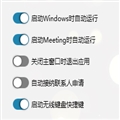
 1 <UserControl.Resources>
 2         <ResourceDictionary>
 3             <ResourceDictionary.MergedDictionaries>
 4                 <ResourceDictionary Source="../Controls/CResource/SliderCheckBox.xaml" />
 5             </ResourceDictionary.MergedDictionaries>
 6         </ResourceDictionary>
 7     </UserControl.Resources>
 8 <StackPanel>
 9   <CheckBox Style="{DynamicResource SliderCheckBox}" Content="启动Windows时自动运行"
      IsChecked="{Binding WindowsAutomatically, Mode=TwoWay}" Margin="0,0,0,15"/>
10 </StackPanel>

 相关文章
相关文章![[ASP.NET MVC 小牛之路]13](/Upload/SmallIMG/2013111903/93057646EF855810.png)