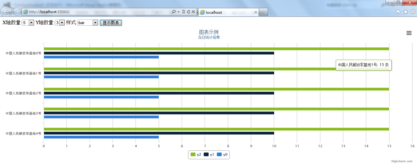
在使用HighCharts控件过程中,发现图表可以自适应div的高度,无法根据图表x、y轴的数量动态调整div高度,否则图标挤在一起,看起来非常不美观,也无法达到用户的要求。
示例代码下载
C#通过SQL语句得到统计结果,使用DataTable来存放数据,则数据格式为
x    y1    y2    y3    y4
0    10    20    30    40
1    20    20    40    30
2    50    50    50    50
3    40    50    30    20
而实现图表的JS代码段如下:
        <script type="text/javascript">
$(function () {
        $('#container').highcharts({
            chart: {
                type: 'area'
            },
            title: {
                text: 'US and USSR nuclear stockpiles'
            },
            subtitle: {
                text: 'Source: <a href="http://thebulletin.metapress.com/content/c4120650912x74k7/fulltext.pdf">'+
                    'thebulletin.metapress.com</a>'
            },
            xAxis: {
                labels: {
                    formatter: function() {
                        return this.value; // clean, unformatted number for year
                    }
                }
            },
            yAxis: {
                title: {
                    text: 'Nuclear weapon states'
                },
                labels: {
                    formatter: function() {
                        return this.value / 1000 +'k';
                    }
                }
            },
            tooltip: {
                pointFormat: '{series.name} produced <b>{point.y:,.0f}</b><br/>warheads in {point.x}'
            },
            plotOptions: {
                area: {
                    pointStart: 1940,
                    marker: {
                        enabled: false,
                        symbol: 'circle',
                        radius: 2,
                        states: {
                            hover: {
                                enabled: true
                            }
                        }
                    }
                }
            },
            series: [{
                name: 'USA',
                data: [null, null, null, null, null, 6 , 11, 32, 110, 235, 369, 640,
                    1005, 1436, 2063, 3057, 4618, 6444, 9822, 15468, 20434, 24126,
                    27387, 29459, 31056, 31982, 32040, 31233, 29224, 27342, 26662,
                    26956, 27912, 28999, 28965, 27826, 25579, 25722, 24826, 24605,
                    24304, 23464, 23708, 24099, 24357, 24237, 24401, 24344, 23586,
                    22380, 21004, 17287, 14747, 13076, 12555, 12144, 11009, 10950,
                    10871, 10824, 10577, 10527, 10475, 10421, 10358, 10295, 10104 ]
            }, {
                name: 'USSR/Russia',
                data: [null, null, null, null, null, null, null , null , null ,null,
                5, 25, 50, 120, 150, 200, 426, 660, 869, 1060, 1605, 2471, 3322,
                4238, 5221, 6129, 7089, 8339, 9399, 10538, 11643, 13092, 14478,
                15915, 17385, 19055, 21205, 23044, 25393, 27935, 30062, 32049,
                33952, 35804, 37431, 39197, 45000, 43000, 41000, 39000, 37000,
                35000, 33000, 31000, 29000, 27000, 25000, 24000, 23000, 22000,
                21000, 20000, 19000, 18000, 18000, 17000, 16000]
            }]
        });
    });


        </script>
因此,我的想法则是,将DataTable内的数据,转换成以上脚本,直接抛给客户端,其次还需要告知客户端X轴和Y轴的数量,便于客户端根据实际情况调整div的高度或宽度。具体的实现如下:
using System;
using System.Collections.Generic;
using System.Data;
using System.Text;

namespace Chen.Common
{
    public class HighCharts
    {
        public string title = string.Empty;
        public string subtitle = string.Empty;
        public bool showY = false;
        public string type = string.Empty;

        private string xAxis = string.Empty;
        private string yAxis = string.Empty;
        private string series = string.Empty;
        private int xLen = 0;
        private int yLen = 0;

        public string GetChart(DataTable dt)
        {
            //记录Y轴数据
            var arrYData = new string[dt.Columns.Count - 1];
            //Y轴数据模板
            var tem = @"{name: '{0}',data: [{1}]}";
            for (var i = 0; i < dt.Columns.Count; i++)
            {
                var arr = new string[dt.Rows.Count];
                for (var j = 0; j < dt.Rows.Count; j++)
                {
                    //将空数据转换为0
                    var value = dt.Rows[j][i].ToString();
                    if (string.IsNullOrEmpty(value))
                    {
                        value = "0";
                    }
                    arr[j] = value;
                }
                if (i > 0)
                {
                    arrYData[i - 1] = tem.Replace("{0}", dt.Columns[i].ColumnName)
                        .Replace("{1}", string.Join(",", arr));
                }
                else
                    xAxis = "'" + string.Join("','", arr) + "'";
            }
            series = string.Join(",", arrYData);
            //记录x轴和y轴的长度
            xLen = dt.Rows.Count;
            yLen = dt.Columns.Count - 1;
            return GetChart();
        }

        private string GetChart()
        {
            var tem = @"<script type='text/javascript'> var chart = new Highcharts.Chart({chart: {renderTo: 'container',type: '#type'},title: {text: '#title'},subtitle: {text: '#subtitle'},xAxis: {categories: [#xAxis]},yAxis: {min: 0,title: {text: '#yAxis'}},legend: {backgroundColor: '#FFFFFF',reversed: true},tooltip: {formatter: function() {return ''+this.x +': '+ this.y +' 条';}},plotOptions: {column: {pointPadding: 0.2,borderWidth: 0}},series: [#series]});</script>";
            tem = tem.Replace("#title", title)
                .Replace("#series", series)
                .Replace("#subtitle", subtitle)
                .Replace("#xAxis", xAxis)
                .Replace("#yAxis", yAxis)
                .Replace("#showY", showY.ToString().ToLower())
                .Replace("#type", type);
            var retStr = new StringBuilder("{");
            retStr.AppendFormat("\"x\":{0},\"y\":{1},\"chart\":\"", xLen, yLen);
            retStr.Append(tem.ToString());
            retStr.Append("\"}");
            return retStr.ToString().Replace("\n", "");
        }
    }
}
基本上算是满足了期望值。在我看来,图表能自动调节容器的高度或宽度,官方应该提供一个示例或者解决方案,否则在容器一定的情况下,图表自定义容器,则很有可能将图表挤压的看起来不舒服。不知道是不是我没有找到合适的解决方案,如果有人知道,期待你留言告知,谢谢!