WPF中的Style类似于Web应用程序中的CSS,它是控件的一个属性,属于资源的一种。
ControlTemplate和DataTemplate区别:
ControlTemplate用于改变控件原来的形状(一般定义在Style中,给控件穿上一层新的外壳,改变这个控件的外观),而DataTemplate不改变控件原来的形状(给某个控件加上数据,相当于给控件显示它想显示的内容(可能会有多种控件组合))。
通常把Style定义在Resources中,使用方式如下:
class="brush:csharp;gutter:true;"><Windows.Resources>
  <Style  x:Key="btnstyle"  TargetType="Button">
     <Setter Property="Width" Value="80"/>
     <Setter Property="Height" Value="50"/>
     <Setter Property="Foreground" Value="Pink"/>
     <Setter Property="FontSize" Value="20"/>
     <Style.Triggers>
        <Trigger Property="IsMouseOver" Value="true">
           <Setter Property="Background" Value="pink"/>
        </Trigger>
        <MultiTrigger>
          <MultiTrigger.Conditions>
             <Condition Property="IsMouseOver" Value="false"/>
             <Condition Property="FontSize" Value="20"/>
          </MultiTrigger.Conditions>
          <MultiTrigger.Setters>
             <Setter Property="Background" Value="Gold"/>
          </MultiTrigger.Setters>
        </MultiTrigger>
     </Style.Triggers>
  </Style>
<Window.Resources>
<Button x:Name="button1" Style="{StaticResource btnstyle}" Content="button1" >
button1.style=(style)Resources["btnstyle"];
如果只需对控件进行小幅度修饰(调整大小、位置、字体、颜色等)就用style;如果需要改变控件的外观和行为就用controlTemplate(形状、事件触发如鼠标停留效果等)。在实际项目中,经常把Template定义在Style中,通过Style 中的Property来设置控件的Template属性。
WPF中的所有COntrol控件都有Template属性。下面以代码的形式,展现WPF中常用的Template。
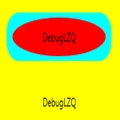
<Window x:Class="WPFXAMLTest.WindowControlTemplate"
        xmlns="http://schemas.microsoft.com/winfx/2006/xaml/presentation"
        xmlns:x="http://schemas.microsoft.com/winfx/2006/xaml"
        Title="WindowControlTemplate" Height="300" Width="300">
    <Grid Background="Yellow">
        <Button Width="200" Height="60" Background="Cyan">
            <Button.Template>
                <ControlTemplate TargetType="Button">
                    <Grid>
                        <Rectangle Width="180" Height="50" Fill="{TemplateBinding Background}" RadiusX="20" RadiusY="20"/>
                        <ContentPresenter Content="{TemplateBinding Content}" VerticalAlignment="Center" HorizontalAlignment="Center" RecognizesAccessKey="True"/>
                    </Grid>
                </ControlTemplate>
            </Button.Template>
                <Button.Content>
                <Grid>
                    <Ellipse Fill="Red" Width="160" Height="40"/>
                    <TextBlock Text="DebugLZQ" VerticalAlignment="Center" HorizontalAlignment="Center"/>
                </Grid>
            </Button.Content>
        </Button>
        <Button  HorizontalAlignment="Left" Margin="105,190,0,0" VerticalAlignment="Top" Width="75">
           <Button.Template>
               <ControlTemplate >
                    <TextBlock Text="DebugLZQ" VerticalAlignment="Center" HorizontalAlignment="Center"/>
                </ControlTemplate>
           </Button.Template>
        </Button>
    </Grid>
</Window>

<Style  x:Key="btnstyle" TargetType="Button">
            <Setter Property="Width" Value="80"/>
            <Setter Property="Height" Value="50"/>
            <Setter Property="Foreground" Value="Pink"/>
            <Setter Property="FontSize" Value="20"/>
            <Setter Property="Template"><!--所有Control控件都有Style和Template属性,前者用来控制控件的原有属性;后者用来定义控件的内部结构,对控件外观和形状进行改变 -->
                <Setter.Value>
                    <ControlTemplate TargetType="Button"><!--ControlTemplate 描述控件的行为和样式-->
                        <Grid Width="80" Height="50">
                            <Image Source="Images/1.png" Stretch="Fill" />
                            <!---->
                            <ContentPresenter HorizontalAlignment="Center"  VerticalAlignment="Center" />
                        </Grid>
                        <ControlTemplate.Triggers>
                            <Trigger Property="IsMouseOver" Value="true">
                                <Setter Property="Effect">
                                    <Setter.Value>
                                        <DropShadowEffect ShadowDepth="4"/>
                                    </Setter.Value>
                                </Setter>
                            </Trigger>
                        </ControlTemplate.Triggers>
                    </ControlTemplate>
                </Setter.Value>
            </Setter>

        </Style>
<Button x:Name="button1" Style="{StaticResource btnstyle}" Content="button1" Click="Button_Click" Margin="30,23,393,238"/>
<Style x:Key="btnstyle2" TargetType="Button">
            <Setter Property="Width" Value="80"/>
            <Setter Property="Height" Value="50"/>
            <Setter Property="ContentTemplate"><!--2.ContentTemplate不改变控件行为的基础上,只对控件内容进行更改 -->
                <Setter.Value>
                    <DataTemplate><!--返回值是 DataTemplate-->
                         <Grid>
                             <Image Source="Images/1.png" Stretch="Fill" />
                              <TextBlock  Text="{TemplateBinding Content}" FontSize="20" HorizontalAlignment="Center" VerticalAlignment="Center" Foreground="Pink" />
                         </Grid>
                    </DataTemplate>
                </Setter.Value>
            </Setter>
        </Style>
<Button x:Name="button2" Style="{StaticResource btnstyle2}" Content="button2" Margin="30,117,392,144" />
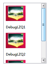
<Style x:Key="lstboxstyle" TargetType="ListBox">
            <Setter Property="ItemTemplate">
                <Setter.Value>
                    <DataTemplate>
                        <StackPanel>
                            <Image Source="{Binding ImgPath}" Width="70" Height="70" Margin="0"/>
                            <TextBlock Text="{Binding ImgTxt}" HorizontalAlignment="Center" Margin="5"/>
                        </StackPanel>
                    </DataTemplate>
                </Setter.Value>
            </Setter>
        </Style>
<ListBox Style="{StaticResource lstboxstyle }" Height="214" HorizontalAlignment="Left" Margin="226,12,0,0" Name="listBox1" VerticalAlignment="Top" Width="153" />
//Binding ListBox
            ArrayList list = new ArrayList();
            list.Add(new { ImgPath="Images/1.png",ImgTxt="DebugLZQ1"});
            list.Add(new { ImgPath = "Images/1.png", ImgTxt = "DebugLZQ2" });
            list.Add(new { ImgPath = "Images/1.png", ImgTxt = "DebugLZQ3" });

            listBox1.ItemsSource = listBox2.ItemsSource = list;
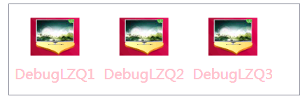
<Style x:Key="lstboxstyle2" TargetType="ListBox">
            <Setter Property="ItemsPanel">
                <Setter.Value>
                    <ItemsPanelTemplate><!-- ItemsPanelTemplate指定控件子项的布局样式,Combox,TreeView,DataGrid,TabelControl也都均有此属性-->
                        <StackPanel Orientation="Horizontal" />
                    </ItemsPanelTemplate>
                </Setter.Value>
            </Setter>
            <Setter Property="ItemTemplate"><!-- ItemTemplate定义子项的外观-->
                <Setter.Value>
                    <DataTemplate><!-- 返回值DataTemplate-->
                        <StackPanel>
                            <Image Source="{Binding ImgPath}" Width="70" Height="70" Margin="0"/>
                            <TextBlock Text="{Binding ImgTxt}" HorizontalAlignment="Center" Margin="5" Foreground="Pink"/><!--可以这里改-->
                        </StackPanel>
                    </DataTemplate>
                </Setter.Value>
            </Setter>
            <Setter Property="ItemContainerStyle"><!--也能在这里改,也能直接在TextBlock里改-->
                <Setter.Value>
                    <Style TargetType="ListBoxItem">
                        <Setter Property="FontSize" Value="20"/>
                    </Style>
                </Setter.Value>
            </Setter>
        </Style>
<ListBox Style="{StaticResource lstboxstyle2 }" Height="131" HorizontalAlignment="Left" Margin="42,256,0,0" Name="listBox2" VerticalAlignment="Top" Width="417" />
 相关文章
相关文章
