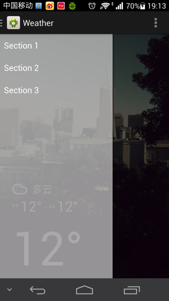
侧拉菜单作为常见的导航交互控件,最开始在没有没有android官方控件时,很多时候都是使用开源的SlidingMenu,一直没机会分析侧拉菜单的实现机理,本文将分析android.support.v4.widget.DrawerLayout的使用及实现。

官方介绍
DrawerLayout acts as a top-level container for window content that allows for interactive "drawer" views to be pulled out from the edge of the window.
Drawer positioning and layout is controlled using the
android:layout_gravityattribute on child views corresponding to which side of the view you want the drawer to emerge from: left or right. (Or start/end on platform versions that support layout direction.)To use a DrawerLayout, position your primary content view as the first child with a width and height of
match_parent. Add drawers as child views after the main content view and set thelayout_gravityappropriately. Drawers commonly usematch_parentfor height with a fixed width.
DrawerLayout.DrawerListenercan be used to monitor the state and motion of drawer views. Avoid performing expensive operations such as layout during animation as it can cause stuttering; try to perform expensive operations during theSTATE_IDLEstate.DrawerLayout.SimpleDrawerListeneroffers default/no-op implementations of each callback method.As per the Android Design guide, any drawers positioned to the left/start should always contain content for navigating around the application, whereas any drawers positioned to the right/end should always contain actions to take on the current content. This preserves the same navigation left, actions right structure present in the Action Bar and elsewhere
DrawerLayout直译的事抽屉布局的意思,作为视窗内的顶层容器,它允许用户通过抽屉式的推拉操作,从而把视图视窗外边缘拉到屏幕内,如右图:
抽屉菜单的摆放和布局通过android:layout_gravity属性来控制,可选值为left、right或start、end。通过xml来布局的话,需要把DrawerLayout作为父容器,组界面布局作为其第一个子节点,抽屉布局则紧随其后作为第二个子节点,这样就做就已经把内容展示区和抽屉菜单区独立开来,只需要分别非两个区域设置内容即可。android提供了一些实用的监听器,重载相关的回调方法可以在菜单的交互过程中书写逻辑业务。下面是一个demo布局:
所以DrawerLayout的使用非常简单,和很多容器类布局一样,它本身也继承自ViewGroup,只是在内部实现中会默认将第一个子节点作为内容区,第二个作为抽屉菜单,所以写布局的事后必须牢记,好在现在的IDE已经非常智能,通过引导来创建Drawerlayout时,会自动生成Activity和xml layout布局,比如使用AndroidStudio就非常方便。<!-- A DrawerLayout is intended to be used as the top-level content view using match_parent for both width and height to consume the full space available. -->
<android.support.v4.widget.DrawerLayout
xmlns:android="http://schemas.android.com/apk/res/android"
xmlns:tools="http://schemas.android.com/tools"
android:id="@+id/drawer_layout"
android:layout_width="match_parent"
android:layout_height="match_parent"
tools:context="com.aven.weather.app.MainActivity">
<!-- As the main content view, the view below consumes the entire
space available using match_parent in both dimensions. -->
<FrameLayout
android:id="@+id/container"
android:layout_width="match_parent"
android:layout_height="match_parent"/>
<!-- android:layout_gravity="start" tells DrawerLayout to treat
this as a sliding drawer on the left side for left-to-right
languages and on the right side for right-to-left languages.
If you're not building against API 17 or higher, use
android:layout_gravity="left" instead. -->
<!-- The drawer is given a fixed width in dp and extends the full height of
the container. -->
<fragmentandroid:id="@+id/navigation_drawer"
android:layout_width="@dimen/navigation_drawer_width"
android:layout_height="match_parent"
android:layout_gravity="start"
android:name="com.aven.weather.app.NavigationDrawerFragment"/>
</android.support.v4.widget.DrawerLayout>
Source:
git clone https://github.com/avenwu/DrawerDemo.git